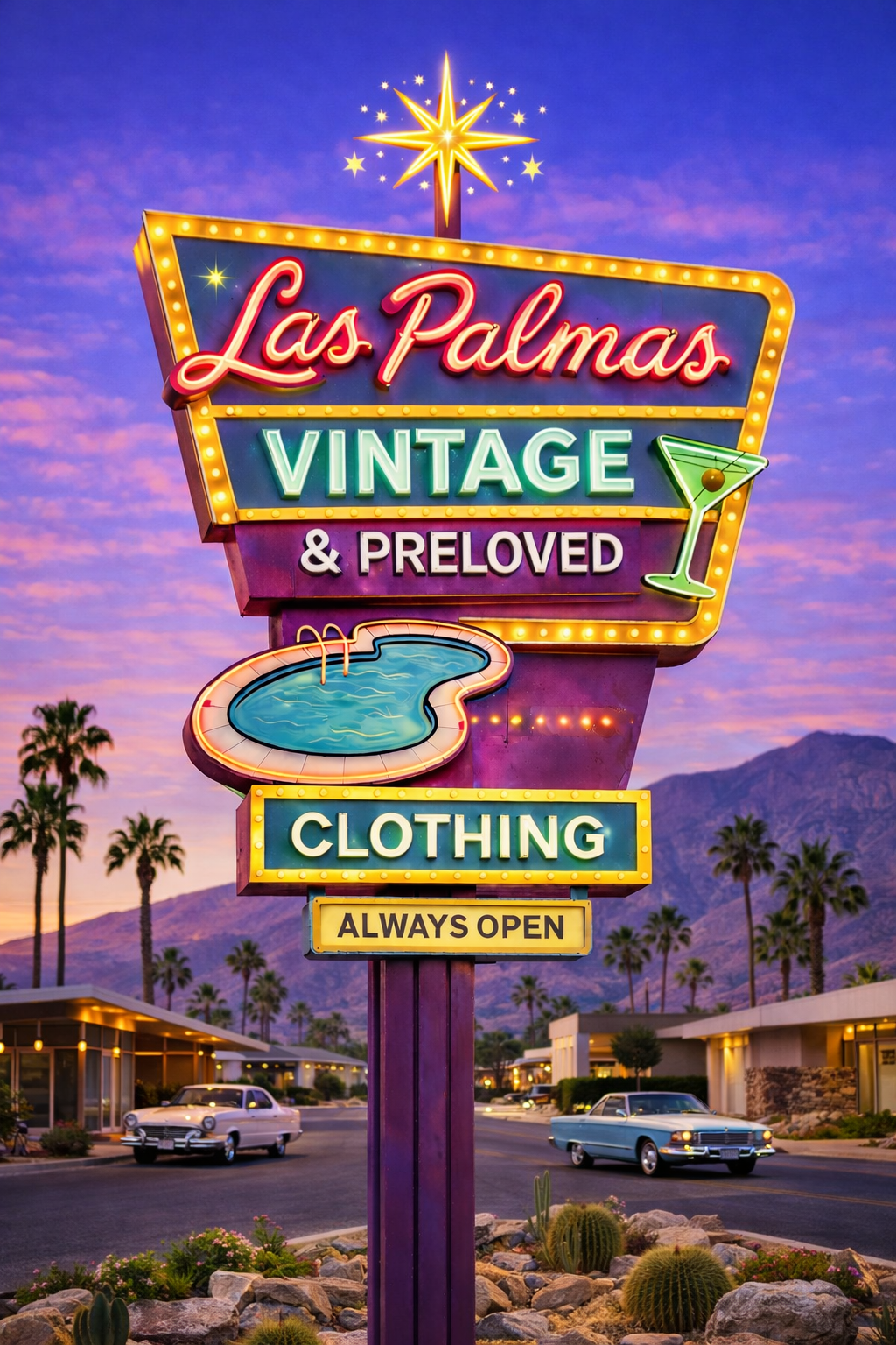
Neon Glamour.
Purple-to-peach desert gradient with the existing neon sign as the hero. Marquee of designer names. The first take, anchored to your current brand assets.
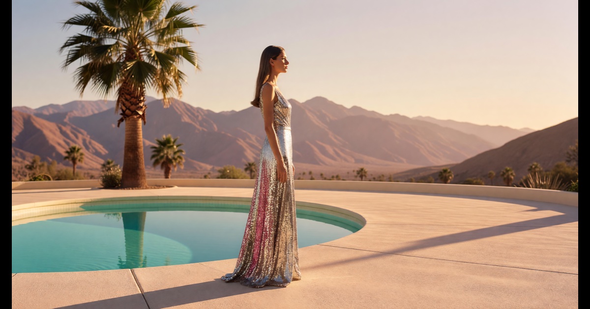
Liquid Glass Editorial.
Vogue magazine cover composition. Oversized italic typography over a Slim-Aarons-style hero, hot pink accents, magazine-spread layout, restrained luxury archive feel.
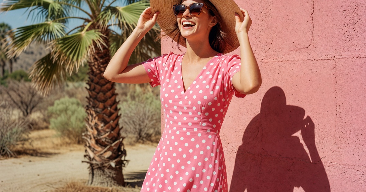
Sun-Drenched Scrapbook.
1970s Palm Springs maximalist. Polaroid product cards with handwritten captions, hibiscus wallpaper, postcard CTAs, terracotta + mustard + palm-green palette.
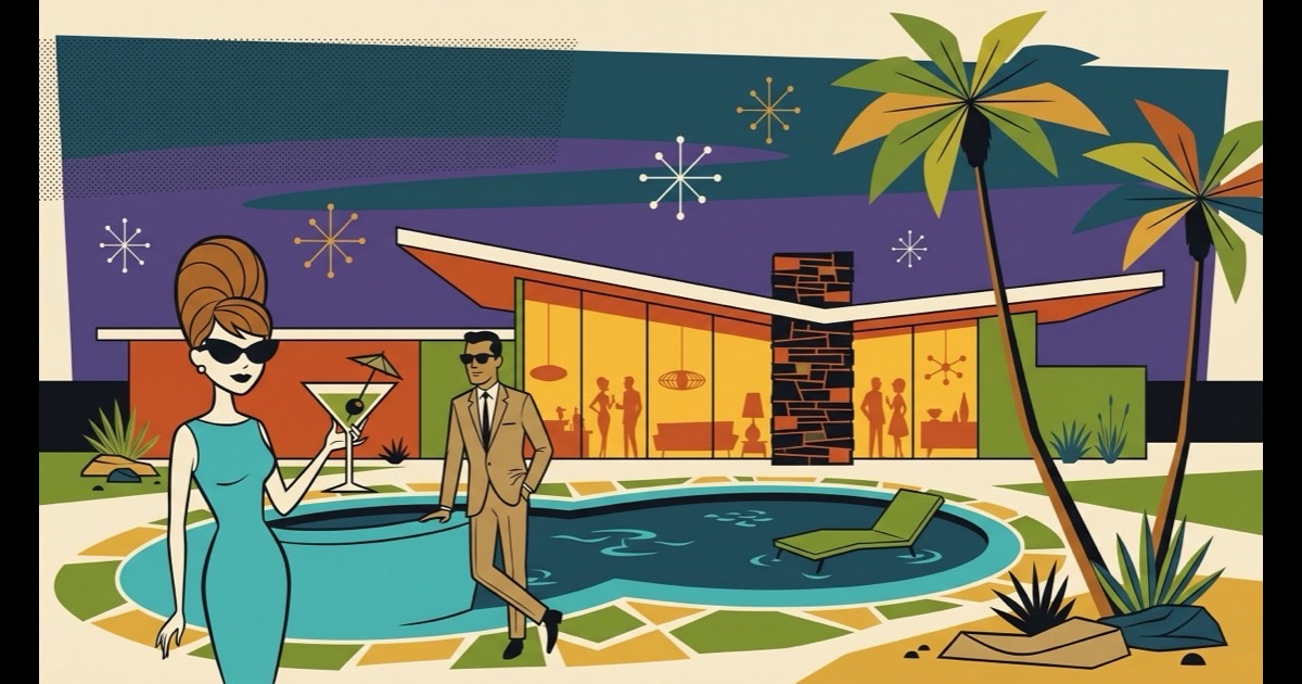
The Atomic Lounge.
A 1962 cocktail party rendered entirely in flat-vector Shag-style illustration. Atomic palette — burnt orange, avocado, mustard, teal, ivory. Sip slow. Stay late.
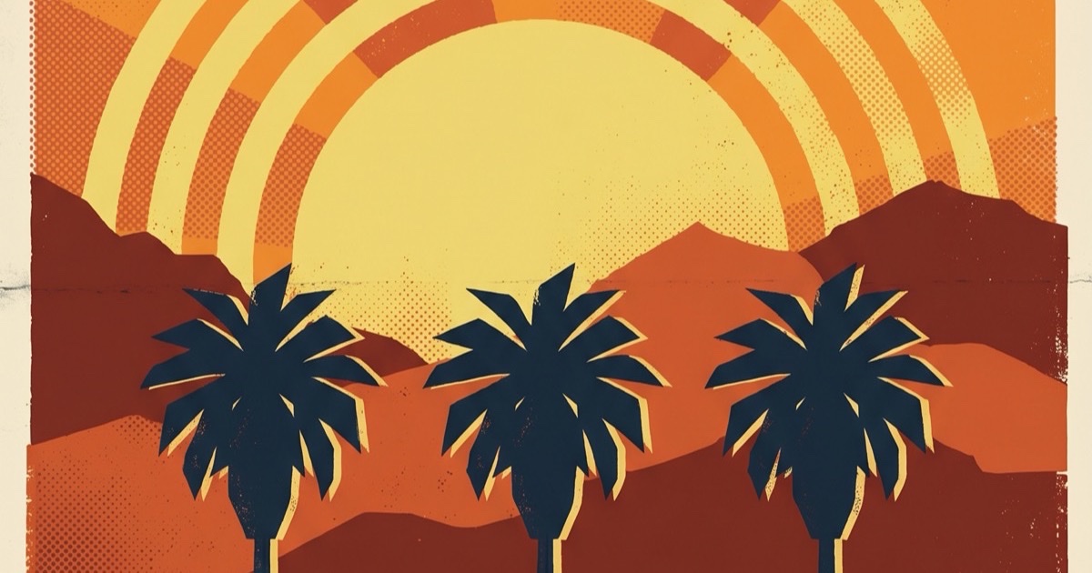
A California Destination.
The brand as a 1962 California travel destination. Three full WPA-style screen-printed travel posters as section dividers — Las Palmas, Desert Modern, Aerial Tramway. Ticket-stub footer.